At SmartCapitalMind, we're committed to delivering accurate, trustworthy information. Our expert-authored content is rigorously fact-checked and sourced from credible authorities. Discover how we uphold the highest standards in providing you with reliable knowledge.
What are the Best Colors for Advertising?
The best colors for advertising are those that make people comfortable or stimulate their senses; knowing which color does that depends on what is being advertised. In general, color schemes can be pooled into three categories: warm, cool, and black and white. Warm colors include those with shades of red or yellow, while cool colors typically include various shades of blues and greens. Restaurants often choose warm colors because they are thought to increase a person's appetite. Many corporations choose cool colors because blues and greens are generally associated with knowledge and understanding; other companies choose a black and white ad for a clean contrast.
Warm Colors

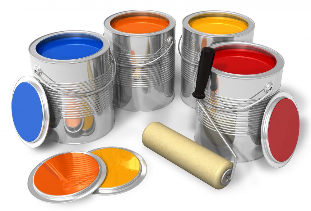
Bright red, orange, and yellow are warm colors, indicative of fire, and they stimulate excitement. Virtually all logos, advertisements, and menus of fast food chains feature these colors, which is no accident; companies rely on the extensive research that has been done in this field to get the most for their advertising dollars. Warm colors are some of the best colors for advertising food as they are known to increase the appetite, which may translate to higher revenue. Many restaurants and fast food chains use primarily red and yellow in their advertising.

A color scheme that incorporates warm colors also encourages people to linger, which is why many restaurants are decorated in deep burgundy, burnt orange, and other similar colors. These colors stimulate warmth and comfort, and when people relax over dinner, they are more likely to enjoy a leisurely dessert or a cup of coffee, thus spending more money. When designing a menu, it is important to understand that warm colors come to the front, while cool colors recede; when combining warm and cool colors on something like a menu, it is best to use less of the warm color.
Cool Colors

Besides knowledge and understanding, some shades of blue are also associated with tranquility, and other shades represent an important life source — water. As a result of these peaceful connotations, the color blue can actually slow a person's heart rate and reduce appetite, which is why is not often chosen for restaurant advertising. On the other hand, shades of light blue are some of the best colors for advertising over-the-counter medicines and other health products. Light blue can have a calming effect on people and it is most often associated with health and healing.
Darker shades of blue indicate dependability and integrity making it a good color for business ads and logos. Many financial institutions incorporate darker shades of blue in their logos to reflect these values. Blue, particularly dark blue, is also a popular color for uniforms, worn by mail carriers, security guards, and police officers, among others.
Many websites use at least some blue in their color schemes, but it has been debated whether or not blue is one of the best colors for advertising online. Some people argue that it does not catch the reader's attention fast enough or often enough, while others argue that the color evokes positive emotions and experiences. Colors like sky blue and certain shades of green can also be effective in advertising as they evoke the feeling of being outdoors, which may be appropriate for many situations.
Black and White
According to research, black and white can be two of the best colors for advertising because they create a strong contrast when paired together. Black and white often signify opposite emotions: white is often associated with purity and perfection, while black usually represents power, elegance, or evil. When used together, however, black and white can create a sense that a company is highly professional. Often a splash of color, such as red, is included to accent the starkness, but the overall appeal of a black and white advertisement is created through contrast.
Choosing Colors
Many studies have been done regarding the influence of color on people's emotions and actions; in many cases, it may be wise to review some of the studies to select colors that evoke the desired results. Many companies choose to hire a graphic designer to select the best colors for advertising the company's product. Alternately, a business can conduct an experiment to make the best color choice: several employees can look over various websites and see which sites most entice them to continue viewing.
AS FEATURED ON:
AS FEATURED ON:


Discussion Comments
Thumbs up for such a great post. A color in a brand really affects a product and sometimes becomes a deciding factor of success and failure of a brand.
Even marketers believe that the color in trademarks has an impact on customers and they have a power to shape a customer's opinion about a product. Moreover, colors also affect the purchasing behavior of customers to a great extent. --Nitin
@post 14: The dark blue and red. Isn't that pepsi, or is the blue lighter than you mean? Not sure what I think.
Thanks for all the advice. This will be really useful when we have to pick out storefront signs for our new store!
Cool. Very helpful for my project.
Grey colors are rare in advertising because they do not catch the attention of the eye. Seriously, go into a grocery store or a big store like Wal-Mart and notice how little grey you see.
This seems funny to me because so many people wear grey clothes from shirts, to pants, to scarves and beyond. You would never buy a grey box of cereal, but we are happy to drape ourselves in the same drab color.
It seems like red, white and blue show up in a lot of ads. I suppose this is to remind people of the American flag and illicit feeling of patriotism and national pride. I would like to say that this is a cheap gimmick, but I am sure that I have fallen for it many more times than I realize.
There is one thing I would like to "put on the table," so to speak. Has anyone noticed the prevalent color combination of blue and orange on dvd cases and video game cases? Usually makes for a more epic outlook on the movie/game.
I am wondering how color schemes would affect people with regard to signs. I am guessing that shades of blue and green would work well in attracting prospective renters to an apartment community. Any thoughts?
The use of color in advertising has always fascinated me. Despite all the research that has been done on the topic, some companies still manage to mess up certain things. One of the most annoying things I’ve seen companies do is make the text and background colors too similar. For instance, if an ad is white and the text on it is a light yellow. It makes for a blurry, eyesore of an effect.
@klorine – On the topic complimentary colors, I’ve noticed some weird things too. Colors that are close to complimentary but aren’t quite exact can have a sensational but weirdly off-putting effect. The most notable example of this that I’ve observed is dark blue and red. The combination is close to the winning orange and blue, but the effect is painful rather than bright and sensational. Has anyone else noticed this?
Many companies like to use complimentary colors in their advertising. This is generally because complimentary colors create a very vivid sensation. Black and white are complimentary colors, as the article discussed. Some other effective complimentary pairs are red and green, purple and yellow, and perhaps most effective in advertising, blue and orange. Tropicana, the juice company, has used the orange and blue combination to great effect, as it is one of the most well-known orange juice varieties in the world.
Black definitely implies elegance and professionalism. I've found myself drawn to labels that are primarily black, often with just a touch of gold, silver, or red.
Post your comments